I don't know what others think, and I am no artist, but I would like to see the left hand side of the check a little bit lower than the right hand side. At this point, IMO, it looks too much like a v.Daniel Carrera wrote:
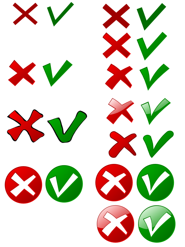
I think it'd be cool to replace words by icons. You know, a green checkmark to replace "yes" and a red "x" to replace "no".
Thoughts?
I don't know how to make these and make them cool. So I was hoping that one of our local artists would be willing to contribute that.
see if you like this:
http://ooo.nicubunu.ro/checkmarks.png
in case you like them but adjustments are needed, here is the source:
http://ooo.nicubunu.ro/checkmarks.svg
Other than that, I think they are nice and fit the OOo motif well. Good work!
--
Peter Kupfer
OOo user since 'OO4
http://peschtra.tripod.com/open_office/ooo_front.htm