Hi Christoph, Bernard, all,
I know the time constraint plays an important role in this, and for what
its worth,
I think you've come up with a really professional icon Design in a short
amount of time.
I'm just sorry my contributions lately have been all talk and no
graphics. Talk is cheap.
On 1/10/2011 10:23 AM, Christoph Noack wrote:
Here is the original version:
http://picasaweb.google.com/noack.christoph/LibreOffice#5558854821889918786

Here is the refined version:
http://picasaweb.google.com/noack.christoph/LibreOffice#5560329076596107730

Opinion(s)?
I think the lighter interior is an improvement and I _would_ recommend
switching the icons so that the current template icons serve as document
icons.
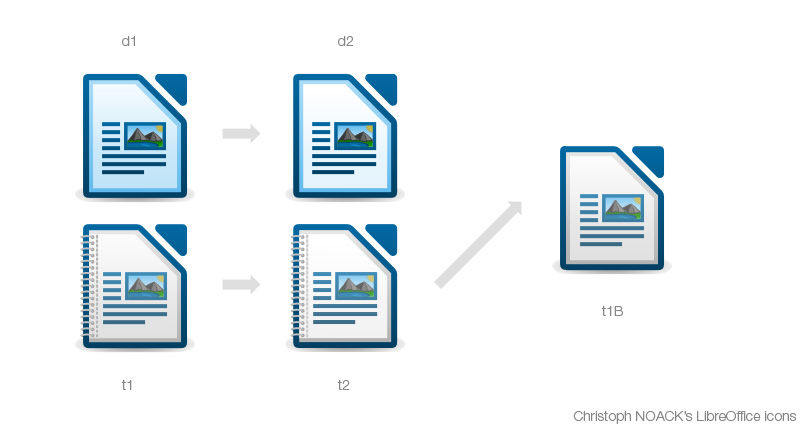
It is hard to explain in just words, so please refer to this image I
hacked together to help explain;
http://tdf.nikashsingh.com/misc/christophicon.jpg
The original template icon (t1) still seems best to me because it looks
like a Paper stack, backed against a blue folder lining.
Of the new lighter versions, while they are an improvement, t2 has no
light-grey gradient on the white inner surface and d2 uses a light-blue
inner border.
My eyes interpret this as;
- t2 loses the consistent look because it doesn't share the "universal
top-lighting" that shades its border and page contents (the
mock-paragraph-lines)
- d2 loses the impression of a pile of stacked pages because the inner
border is blue rather than grey. Reducing the effect of depth.
I think t1 is perfect the way it was originally. Just drop the binder
and reinstate the grey left-inner-border (t1B) and it's a perfect
document icon.
I understand that time has run out. This is not a change-request, just
feedback.
But that is just my opinion. I pay too much attention to these details =)
I LOVE the template (binder) icon. Great stuff Christoph!
Oh, thanks a lot ... but really, I'm just jumping in because we miss a
"pro" here :-)
In my opinion, anyone capable of creating this; ...
http://picasaweb.google.com/noack.christoph/LibreOffice#5558854821889918786
... is someone I'd readily consider a "Pro".
And Bernhard, I think your proposal to complete the icons in their
current form is most reasonable.
There will be a chance to address these small issues down the track,
like you mentioned, and I think Lib/O deserves non-OOo icons! =)
+1 to your "icon finalisation agenda"

-Nik

--
Unsubscribe instructions: E-mail to [email protected]
List archive: http://listarchives.libreoffice.org/www/design/
*** All posts to this list are publicly archived for eternity ***