Hi Nik!

Am Dienstag, den 11.01.2011, 01:00 +1100 schrieb Nik:
[...]
> I'm just sorry my contributions lately have been all talk and no
> graphics. Talk is cheap.
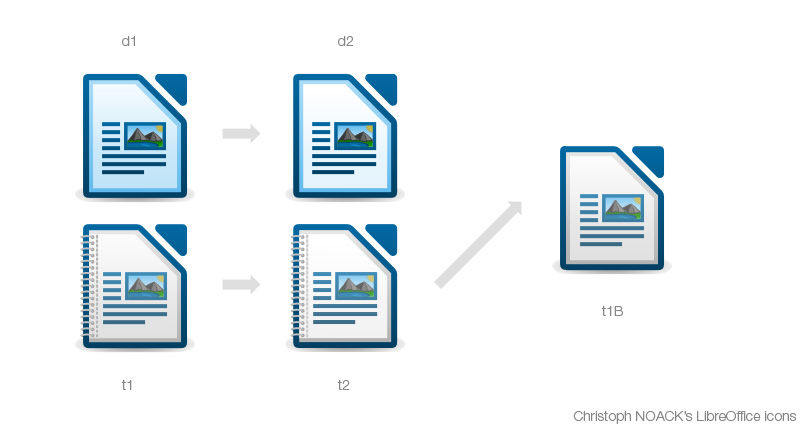
Sometimes it is not ... without that "talk" and the feedback by Ivan,
Björn, Bernhard and who else, there wouldn't be that much progress.

And, because it would be just great - is there any change that you can
join our effort. I know that you have been busy, but I don't know
whether your workload is back to normal again ... Don't feel any
pressure, I still think our project would greatly benefit :-)

> On 1/10/2011 10:23 AM, Christoph Noack wrote:
[...]
> I think the lighter interior is an improvement and I _would_ recommend
> switching the icons so that the current template icons serve as document
> icons.
> It is hard to explain in just words, so please refer to this image I
> hacked together to help explain;
> http://tdf.nikashsingh.com/misc/christophicon.jpg

Thanks for the graphics ... and I got tricked ;-) I felt superior by
using a common gradient for all the icons, but now the template document
got also changed by removing some transparency. Of course, I intended to
be t2 like t1 (it somehow feels like talking about the Terminators).

[...]

> I think t1 is perfect the way it was originally. Just drop the binder
> and reinstate the grey left-inner-border (t1B) and it's a perfect
> document icon.

So, question - to combine the requests by Björn, the quick draft by
Bernhard and your ideas. Would it help to ...
      * use t1B as the document icon
      * use d1 plus binder as the template icon

Advantages:
      * The template icon looks significantly different (color)
      * We can keep the color of the symbolism (e.g. color of the
        landscape picture) without loosing contrast
      * Effort for the changes is rather low

Disadvantage: The application icons will look more like document, but
this is okay to me. First step, I'd say :-)

[...]

> And Bernhard, I think your proposal to complete the icons in their
> current form is most reasonable.
> There will be a chance to address these small issues down the track,
> like you mentioned, and I think Lib/O deserves non-OOo icons! =)
> +1 to your "icon finalisation agenda"

;-)

Cheers,
Christoph


--
Unsubscribe instructions: E-mail to [email protected]
List archive: http://listarchives.libreoffice.org/www/design/
*** All posts to this list are publicly archived for eternity ***