Hi,

Some background:
* Colibri
** menus displayed on hover
** custom menu JS
** menu entries could be icon+label+separator+link+whatever
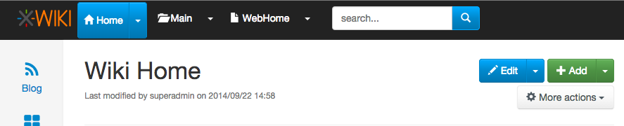
* Flamingo
** menus displayed on click
** menu component from Bootstrap
** it expects simple links or menu dropdown containers (not both functions)

Theoretically Bootstrap doesn't support our use case and cannot replicate
by default the Colibri's behavior.
Any change we want to make to the menu Bootstrap component means we are
branching from the default behavior and we will create a custom one.
We really need to listen to clicks and not hover state, since we need to be
mobile compatible.

It's normal that the users feel a bit confused since they are used with a
certain behavior and we tried to mix them in order to have both menu and
navigation use cases.
And I think the reason is a bit confusing is that the separation between
the link and the arrow is invisible, compared with the btn-groups used for
Edit or Add. For example, I think that making the separation more clean,
like in this screenshot
http://jira.xwiki.org/secure/attachment/28807/btn-group.png would improve a
bit the things, but would need visual improvements and is not default also.
Maybe we could think of a better solution if we were to go on this path.

Behavior like double clicking a certain element will be a hidden
interaction for the users. Double clicking is not a Web behavior and you
cannot expect users to know on which links to simple click vs. on which to
double click. In the usability testing sessions users had a hard time to
double click on uploading image in the WYSIWYG popup, so I'm not sure about
this approach's success.

Regarding the IntelliJ IDEA screenshot, we already discuss about this idea
and even made a similar proposal some long time ago, see
http://design.xwiki.org/xwiki/bin/view/Improvements/ActionMenuNavigation
Although this proposal is a nice idea and I would like to have it, I don't
see how this would 'simplify' the current implementation. IMO it will make
it even more complex and we would certainly need a custom menu. Also I see
this as a new feature, than a solution to our current problem.

When we implemented the current solution we discussed if the navigation
should be put on the text or on the icon, see
http://jira.xwiki.org/browse/XWIKI-10449 . The main problem is the
findability of this functionality. Users might never press that icon (this
problem applies to the solution brainstorming and the breadcrumb proposal).

So I think the idea to have an entry with "Go to ..." could be a solution
and to keep the menus interact with the default behavior (removing the
navigation from the dropdown activator).
Removing triangles is not an option. That is a default menu marker caret.

So what are the next steps? We do a issue with the "Go to ..." solution?

Thanks,
Caty

On Wed, Sep 24, 2014 at 11:55 AM, Guillaume "Louis-Marie" Delhumeau <
[email protected]> wrote:

> Hi.
>
> I am happy that this topic is coming back.
>
> 2014-09-24 10:04 GMT+02:00 [email protected] <[email protected]>:
>
> > Hi devs,
> >
> > I’ve had a few persons tell me that they don’t like the small arrow in
> the
> > top level menu in Flamingo. It seems they either don’t understand the
> > little triangles and what it’s about (submenu?) or they click on the menu
> > itself and go to another page when they were expecting some menu to drop
> > down, or...
> >
>
> I don't like it neither. It is not consistent with other projects (such as
> JIRA). It is not consistent with what we are planning to do about the UI
> language (see:
>
> http://design.xwiki.org/xwiki/bin/download/Proposal/InterfaceAndContentLanguageSeparation/1.1Preview.png
> ).
> It is harder to use on mobiles, and people are surprised by what occurs
> when they click on it.
>
>
> >
> > In addition we’re still missing a solution to easily navigate the wiki
> > from any page (there’s the ctrl+G solution but this is more like a
> shortcut
> > to know and we need something more).
> >
> > So here are some ideas:
> >
> > * For the top level menu, make it simpler by having the drop down display
> > when you click anywhere in the menu (the whole width of it) and only
> > navigate when you double click (there are actually few reasons to need to
> > navigate with the other idea below so we could also not do the double
> click
> > thing)
> >
>
> +1
>
>
> >
> > * In the breadcrumb OR in the top level menu OR in both (to be decided)
> > use something like this (screenshot taken from IntelliJ IDEA):
> >
> >
> https://www.evernote.com/shard/s119/sh/20e99ab3-2991-4aa8-a7b5-93088aad4944/aa6d10a258c9c4c7c69ede4fd45a1254
> >
> > This means when you click at a given level you get to see all sibling
> > elements in the wiki for element you’re currently on (document, space,
> > wiki).
> >
> > For example clicking on the “Home” wiki would show:
> > - A filter box allowing you to type and it would auto suggest as you
> type,
> > completing with wiki names
> > - An icon would be displayed on the left (or on the right) of the filter
> > box and if you click on it you’ll go the index page (Wiki Index in this
> > case)
> > - A list of the first 10 wikis (an improvement would be to list first the
> > wiki that you’ve last navigated to)
> >
> > Same would apply for spaces and pages.
> >
> > We could even imagine that when you’re on a user profile page, clicking
> on
> > it would display other user pages and the filter would filter on user
> > pages. Actually we could imagine to when the current page has XObjects in
> > it, it would be possible to list all other pages in the wiki having the
> > same XClass. And if there are several XObjects, then somehow in the UI
> > allow selecting which one to consider as the filter criteria.
> >
> > * Note 1: The breadcrumb is currently not displayed on all pages (it’s
> not
> > on the home page for example) and thus if we implement this idea in the
> > breadcrumb only then there’s no solution for navigating on the home page.
> >
>
> This is a behaviour that I have put because I thought it was not pretty to
> have a useless breadcrumb on the home page. It can be changed.
>
>
> >
> > * Note 2: If we were to implement this idea on the top level menu, then
> we
> > still need to display the actions too. Several options:
> > - a) Display the actions first and the navigation list after separated by
> > a -----
> > - b) Have a first entry in the drop down that says “Actions...” and when
> > you move the mouse over it a secondary menu with all actions are
> displayed.
> > Note that the alternative is possible too: Display the actions and have a
> > “Go to..." menu entry. We would just need to choose to display what we
> > think is the most used default (actions or navigation)
> >
>
> +1
>
>
> >
> > WDYT?
> >
> > Personally I would do this:
> > - implement this idea for the breadcrumb
> >
>
> +0, I need to think more about it
>
>
> > - add “Go to wiki...”, “Go to space...", “Go to page..." menu entries in
> > the Wiki/Space/Page top level menus
> >
>
> +1
>
>
> > - expand the menu selection to the whole width for displaying the drop
> > down (and not just above the small arrow)
> >
>
> +1
>
>
> > - either support double-click or simply add the possibility to navigate
> to
> > that element in the “Go to xxx...” submenu
> >
>
> +1
>
>
> >
> > Thanks
> > -Vincent
> >
> >
> > _______________________________________________
> > devs mailing list
> > [email protected]
> > http://lists.xwiki.org/mailman/listinfo/devs
> >
>
>
>
> --
> Guillaume Delhumeau ([email protected])
> Research & Development Engineer at XWiki SAS
> Committer on the XWiki.org project
> _______________________________________________
> devs mailing list
> [email protected]
> http://lists.xwiki.org/mailman/listinfo/devs
>
_______________________________________________
devs mailing list
[email protected]
http://lists.xwiki.org/mailman/listinfo/devs