On 9 Oct 2014 at 14:02:05, Eduard Moraru
([email protected](mailto:[email protected])) wrote:
> Folks, you speak of consistency and then come up with this solution...
>
> So we have a problem with "non-standard bootstrap dropdown buttons" that
> our users (whoever they may be) have a problem with understanding that
> there is either an action or a dropdown involved in the same button, like
> they can encounter in other interfaces along their computer usage history.
>
> Our solution is to stop using the mixed mode, and only use the "standard
> bootstrap dropdown buttons" that have their first action in the submenu the
> thing that would have happened in the past when the users clicked directly
> the action part of the "mixed button" we were using.
>
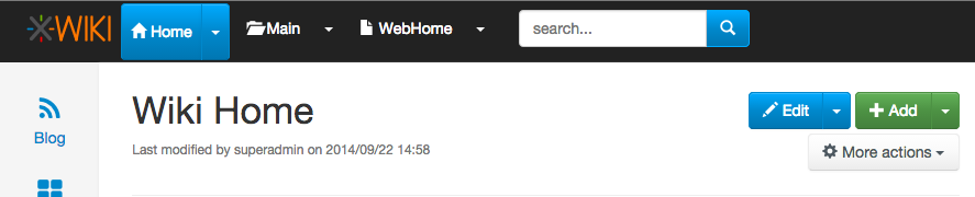
> Ok, we implement this solution, but we only do it for the top navigational
> elements. We completely ignore the "Add" and the "Edit" buttons that
> "suffer" from exactly the same "problem".
>
> My question is: why?
>
> If we do/did decide that this is the way to go, we should at least be
> consistent and do it everywhere in the UI, otherwise it just causes
> frustrations.
There’s a difference. For the Edit/Add button click the button will do what the
user wants. Click the arrow is only for advanced featurs.
Thanks
-Vincent
> Thanks,
> Eduard
>
> On Fri, Oct 3, 2014 at 4:21 PM, Ecaterina Moraru (Valica) > > wrote:
>
> > On Wed, Sep 24, 2014 at 5:25 PM, Ecaterina Moraru (Valica) <
> > [email protected]> wrote:
> >
> > > Hi,
> > >
> > > Some background:
> > > * Colibri
> > > ** menus displayed on hover
> > > ** custom menu JS
> > > ** menu entries could be icon+label+separator+link+whatever
> > >
> > > * Flamingo
> > > ** menus displayed on click
> > > ** menu component from Bootstrap
> > > ** it expects simple links or menu dropdown containers (not both
> > functions)
> > >
> > > Theoretically Bootstrap doesn't support our use case and cannot replicate
> > > by default the Colibri's behavior.
> > > Any change we want to make to the menu Bootstrap component means we are
> > > branching from the default behavior and we will create a custom one.
> > > We really need to listen to clicks and not hover state, since we need to
> > > be mobile compatible.
> > >
> > > It's normal that the users feel a bit confused since they are used with a
> > > certain behavior and we tried to mix them in order to have both menu and
> > > navigation use cases.
> > > And I think the reason is a bit confusing is that the separation between
> > > the link and the arrow is invisible, compared with the btn-groups used
> > for
> > > Edit or Add. For example, I think that making the separation more clean,
> > > like in this screenshot
> > > http://jira.xwiki.org/secure/attachment/28807/btn-group.png would
> > improve
> > > a bit the things, but would need visual improvements and is not default
> > > also. Maybe we could think of a better solution if we were to go on this
> > > path.
> > >
> > > Behavior like double clicking a certain element will be a hidden
> > > interaction for the users. Double clicking is not a Web behavior and you
> > > cannot expect users to know on which links to simple click vs. on which
> > to
> > > double click. In the usability testing sessions users had a hard time to
> > > double click on uploading image in the WYSIWYG popup, so I'm not sure
> > about
> > > this approach's success.
> > >
> > > Regarding the IntelliJ IDEA screenshot, we already discuss about this
> > idea
> > > and even made a similar proposal some long time ago, see
> > > http://design.xwiki.org/xwiki/bin/view/Improvements/ActionMenuNavigation
> > > Although this proposal is a nice idea and I would like to have it, I
> > don't
> > > see how this would 'simplify' the current implementation. IMO it will
> > make
> > > it even more complex and we would certainly need a custom menu. Also I
> > see
> > > this as a new feature, than a solution to our current problem.
> > >
> > > When we implemented the current solution we discussed if the navigation
> > > should be put on the text or on the icon, see
> > > http://jira.xwiki.org/browse/XWIKI-10449 . The main problem is the
> > > findability of this functionality. Users might never press that icon
> > (this
> > > problem applies to the solution brainstorming and the breadcrumb
> > proposal).
> > >
> > > So I think the idea to have an entry with "Go to ..." could be a solution
> > > and to keep the menus interact with the default behavior (removing the
> > > navigation from the dropdown activator).
> > > Removing triangles is not an option. That is a default menu marker caret.
> > >
> > > So what are the next steps? We do a issue with the "Go to ..." solution?
> > >
> >
> > http://jira.xwiki.org/browse/XWIKI-11166
> >
> >
> > > Thanks,
> > > Caty
> > >
> > > On Wed, Sep 24, 2014 at 11:55 AM, Guillaume "Louis-Marie" Delhumeau <
> > > [email protected]> wrote:
> > >
> > >> Hi.
> > >>
> > >> I am happy that this topic is coming back.
> > >>
> > >> 2014-09-24 10:04 GMT+02:00 [email protected] :
> > >>
> > >> > Hi devs,
> > >> >
> > >> > I’ve had a few persons tell me that they don’t like the small arrow in
> > >> the
> > >> > top level menu in Flamingo. It seems they either don’t understand the
> > >> > little triangles and what it’s about (submenu?) or they click on the
> > >> menu
> > >> > itself and go to another page when they were expecting some menu to
> > drop
> > >> > down, or...
> > >> >
> > >>
> > >> I don't like it neither. It is not consistent with other projects (such
> > as
> > >> JIRA). It is not consistent with what we are planning to do about the UI
> > >> language (see:
> > >>
> > >>
> > http://design.xwiki.org/xwiki/bin/download/Proposal/InterfaceAndContentLanguageSeparation/1.1Preview.png
> > >> ).
> > >> It is harder to use on mobiles, and people are surprised by what occurs
> > >> when they click on it.
> > >>
> > >>
> > >> >
> > >> > In addition we’re still missing a solution to easily navigate the wiki
> > >> > from any page (there’s the ctrl+G solution but this is more like a
> > >> shortcut
> > >> > to know and we need something more).
> > >> >
> > >> > So here are some ideas:
> > >> >
> > >> > * For the top level menu, make it simpler by having the drop down
> > >> display
> > >> > when you click anywhere in the menu (the whole width of it) and only
> > >> > navigate when you double click (there are actually few reasons to need
> > >> to
> > >> > navigate with the other idea below so we could also not do the double
> > >> click
> > >> > thing)
> > >> >
> > >>
> > >> +1
> > >>
> > >>
> > >> >
> > >> > * In the breadcrumb OR in the top level menu OR in both (to be
> > decided)
> > >> > use something like this (screenshot taken from IntelliJ IDEA):
> > >> >
> > >> >
> > >>
> > https://www.evernote.com/shard/s119/sh/20e99ab3-2991-4aa8-a7b5-93088aad4944/aa6d10a258c9c4c7c69ede4fd45a1254
> > >> >
> > >> > This means when you click at a given level you get to see all sibling
> > >> > elements in the wiki for element you’re currently on (document, space,
> > >> > wiki).
> > >> >
> > >> > For example clicking on the “Home” wiki would show:
> > >> > - A filter box allowing you to type and it would auto suggest as you
> > >> type,
> > >> > completing with wiki names
> > >> > - An icon would be displayed on the left (or on the right) of the
> > filter
> > >> > box and if you click on it you’ll go the index page (Wiki Index in
> > this
> > >> > case)
> > >> > - A list of the first 10 wikis (an improvement would be to list first
> > >> the
> > >> > wiki that you’ve last navigated to)
> > >> >
> > >> > Same would apply for spaces and pages.
> > >> >
> > >> > We could even imagine that when you’re on a user profile page,
> > clicking
> > >> on
> > >> > it would display other user pages and the filter would filter on user
> > >> > pages. Actually we could imagine to when the current page has XObjects
> > >> in
> > >> > it, it would be possible to list all other pages in the wiki having
> > the
> > >> > same XClass. And if there are several XObjects, then somehow in the UI
> > >> > allow selecting which one to consider as the filter criteria.
> > >> >
> > >> > * Note 1: The breadcrumb is currently not displayed on all pages (it’s
> > >> not
> > >> > on the home page for example) and thus if we implement this idea in
> > the
> > >> > breadcrumb only then there’s no solution for navigating on the home
> > >> page.
> > >> >
> > >>
> > >> This is a behaviour that I have put because I thought it was not pretty
> > to
> > >> have a useless breadcrumb on the home page. It can be changed.
> > >>
> > >>
> > >> >
> > >> > * Note 2: If we were to implement this idea on the top level menu,
> > then
> > >> we
> > >> > still need to display the actions too. Several options:
> > >> > - a) Display the actions first and the navigation list after separated
> > >> by
> > >> > a -----
> > >> > - b) Have a first entry in the drop down that says “Actions...” and
> > when
> > >> > you move the mouse over it a secondary menu with all actions are
> > >> displayed.
> > >> > Note that the alternative is possible too: Display the actions and
> > have
> > >> a
> > >> > “Go to..." menu entry. We would just need to choose to display what we
> > >> > think is the most used default (actions or navigation)
> > >> >
> > >>
> > >> +1
> > >>
> > >>
> > >> >
> > >> > WDYT?
> > >> >
> > >> > Personally I would do this:
> > >> > - implement this idea for the breadcrumb
> > >> >
> > >>
> > >> +0, I need to think more about it
> > >>
> > >>
> > >> > - add “Go to wiki...”, “Go to space...", “Go to page..." menu entries
> > in
> > >> > the Wiki/Space/Page top level menus
> > >> >
> > >>
> > >> +1
> > >>
> > >>
> > >> > - expand the menu selection to the whole width for displaying the drop
> > >> > down (and not just above the small arrow)
> > >> >
> > >>
> > >> +1
> > >>
> > >>
> > >> > - either support double-click or simply add the possibility to
> > navigate
> > >> to
> > >> > that element in the “Go to xxx...” submenu
> > >> >
> > >>
> > >> +1
> > >>
> > >>
> > >> >
> > >> > Thanks
> > >> > -Vincent
> > >> >
> > >> >
> > >> > _______________________________________________
> > >> > devs mailing list
> > >> > [email protected]
> > >> > http://lists.xwiki.org/mailman/listinfo/devs
> > >> >
> > >>
> > >>
> > >>
> > >> --
> > >> Guillaume Delhumeau ([email protected])
> > >> Research & Development Engineer at XWiki SAS
> > >> Committer on the XWiki.org project
> > >> _______________________________________________
> > >> devs mailing list
> > >> [email protected]
> > >> http://lists.xwiki.org/mailman/listinfo/devs
> > >>
> > >
> > >
> > _______________________________________________
> > devs mailing list
> > [email protected]
> > http://lists.xwiki.org/mailman/listinfo/devs
> >
> _______________________________________________
> devs mailing list
> [email protected]
> http://lists.xwiki.org/mailman/listinfo/devs
_______________________________________________
devs mailing list
[email protected]
http://lists.xwiki.org/mailman/listinfo/devs