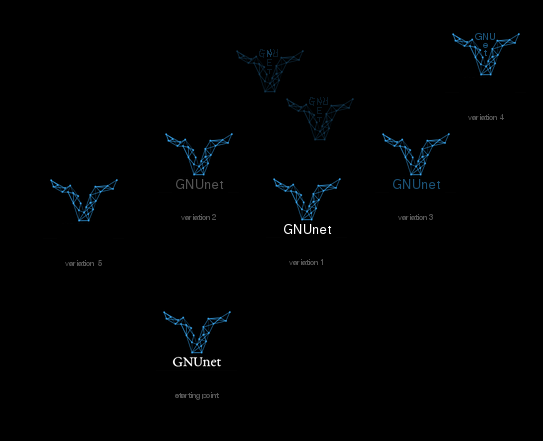
Hi,

> On 17. May 2018, at 13:25, [email protected] wrote:
>
> Hello,
>
> seeing the logo, this network forming the silouette of a gnu, sparked
> excitement in me.
> This is an improvement to the current logo. And it motivated me to
> play a little bit around with its relationship to added writing. Here's the
> result:
> https://abload.de/img/gnunetlogo-sketchesk5u5g.png
>
> My initial impulse to start this was, that I didn't like how the writing was
> designed in relationship to the logo: The serifs made the writing appear so
> antiquated. And that's exactly not what the project needs. The project needs
> refreshment. A timeless, modern, slick look, a look mirroring what the GNUnet
> is: Hot shit. Additionally it was inappropriate: Serifs have a function. They
> make it easier to read huge masses of text. That's why books, especially
> romans, are using typos with serifs.
> But what we have here is not a book. It's an image with maybe 1 word under
> it. So, no need for applying this function.
> Additionally, when the logo is very small, the serifs of the writing below
> the logo are just unnecessary shape vanishing or blurring in the eye of the
> beholder.
> Second point:  A big competition for attention arises between the logo and
> the writing.
> The gnu silouette form of the logo and the horizontal form of the writing are
> next to each other like 2 foreign objects. They have nothing to do with each
> other. They do nothing with each other. They are ignoring each other.
> Additionally, the difference between the white and the colors of the logo
> including the black background made the writing so loud.
>
> Well, and with this starting point, I've made a 1st variation:
> Simply changing typo: Switching over to using typo's variation without serifs
> - GNU FreeFont, which is licensed with GPLv3orlater by itself -
> https://www.gnu.org/software/freefont/index.html . This aspect has it's
> charme, it additionally mirrors the spirit of the GNUnet. And I kind of liked
> the outcome. It improved some of the mentioned aspects. But not all. It was
> still loud.
>
> So I've made variations 2 and 3, both aiming at dimming the writing down,
> harmonizing image and writing more. It was kind of nice. Both prefereable to
> variation 1, if you ask me, but I quickly went over to something I was more
> excited about: Doing a variation 4, a variation based on 2 intuitive sketches
> I've made right away after reading this thread: Transforming the horizontal
> form of the writing into a T-form, which is like the space form of the gnu
> silouette form of the logo, and putting the writing into the logo.
> The charme of it was that it mirrors the image in its double meaning and
> additionally is efficient by saving a letter without losing completeness.
> It was surprising to me, that the outcome was a typical example of 'nice in
> the head, but not so nice in real life'. The T-space in the logo is
> relatively small, so you have to scale down the size of the writing. And that
> to a degree making the outcome too small and puzzle like for practice.
>
> This complete outcome up to this point lead me to variation 5, which is my
> final logo recommendation: Just use the image, and that's it. Let it speak
> for itself, because it can. Leave the writing under it away.
> Not only is that the best solution to the mentioned points, it's also
> something which can be pulled thanks to 2 things: Firstly, how
> self-explanatory the logo as such is, and secondly, the environment in which
> the logo is faced in general.
> The name of the GNUnet project consists of 2 parts: GNU and net.
> Both motives are perfectly blended in the logo. You have a network, and this
> forms the silouette of a gnu. You don't need prior knowledge to understand
> it. You don't need to speak a certain language to understand it. It's
> acultural, it's self-explanatory.
I think that is something I said before about the old logo as well. So I agree
;)
Still a modern font type for GNUnet might make sense as it can be used for all
the text on the webpage.
A carefully selected free font should do.
Can you provide high res versions of the logo? I really like it.

> And it shows what the project does: Networking. But you do need prior
> knowledge to get what that gnu is all about. But the same applies to the
> writing 'GNUnet': You can have it written down letter by letter, but if
> people don't know that GNU stands for the free software movement and what's
> that all about, then they don't understand the writing, either. So, no point
> of difference regarding this aspect between image and writing.
> In addition to that, in what context, in what environment, the logo appears
> most of the time? We look at a screen, seeing it in logical connection and
> close to something, which contains the writing 'GNU'. Maybe it's the URL in
> the address bar, or the hashtag of a social media message, or a keyword
> within a text the GNUnet website or gnu.org.
>
> Feedback regarding the website:
> The website has to get more to the point, and the design has to support that
> by how it divides spaces and shapes them with colors, images, and writings.
> If you want to place 5 bullet points, you better take the whole white space,
> and devide it into 5 parts, each designed differently custom made, individual
> and tasty just for that one bullet point they are supposed to introduce.
> Additionally, you want to keep up interest of the audience through the whole
> site, instead of welcoming them with a structure, saying that 67% of the
> website is not of interest for them and that they're better off with focusing
> their attention to this one third, which is targeted specifically to them.
> The content, the bullet points, have to be in the center of attention, not a
> meta structure sorting the audience into 3 different groups.
> Of course, certain aspects of the GNUnet are more attractive to a certain
> group than others, but there are ways to generalize those points to such a
> degree, that they're also better accessible to other groups. At least to such
> a degree that they understand the value of those points.
> A very good reference for all of this is this website:
> https://www.zeronet.io/en
> The only problem with that is that it's kind of like a visiting card.
> Another reference, which is good, is this website: https://freifunk.net/en/
> Additionally, what the second website makes better than the first reference,
> is that it's not just a visiting card. It strongly interacts with the
> audience. It gives impulse to click on videos, zoom into maps dynamically
> displaying what's going on in the free wireless network that this project
> Freifunk is all about.

Agreed. I am not sure, but isn't there a redesign in the works? Who does it?
And is there progress or is it done behind closed doors? (Just asking)

>
> One last word to the topic 'website text':
> 'ethical internet' ? Good intentions, but too vague. At the bottom GNUnet has
> 2 values:
> empathy and emancipation - it embodies empathy to help other people, and it
> embodies emancipation by facilitating freedom/liberty, it embodies
> emancipation to help other people living their lives in freedom. If values
> are put into the center of attention, the best thing one can do to be
> understood and help the values as such is naming them explicitely and
> concretely.
> I think it's a very good idea to mention the values of the GNUnet, because it
> helps people without technical understanding to understand what drives the
> GNUnet.

I am not entirely sold on the values thing in general but I would be open to
discuss this. I am particularly afraid that ill defined values or "virtues"
will attract all kinds of indoctrinated bigots. We should primarily offer a
tool built on principles, not a biased or political worldview (although I know
particularly CG might disagree).
I am actually not sure if GNUnet has a clear value definition.
Btw I can highly recommend this if somebody is interested in the values topic:
https://www.youtube.com/watch?v=9QMGAtxUlAc

> But then at least additionally some technical key features, bullet points,
> should be dropped: Things like 'distributed', 'anonymous P2P', 'Filesharing',
> 'creating a anonymous and distributed replacement for the old insecure
> Internet' - it's just something early adopters expect to be faced with, are
> looking for, and get very attentive and attracted to.
> It's okay, if these drops are pretty bold and ambitious, because they make
> clear what the project strives for to be or become, and that attracts people
> who want the same, building up momentum into the desired direction of the
> project.

Agreed.

Nice post.

>
>
> Greetings,
> Bastian Schmidt
>
>
> Le ven. 26 janv. 2018 à 1:07, amirouche <address@hidden> a écrit :
>
>    Héllo,
>
>
>    I got into creating a new logo for gnunet and work on the new gnunet
> website.
>
>
>    I did not study a lot the current website and based the mockup on what is
> in
>
>    the www.git repository @ https://gnunet.org/git/www.git/
>
>    My first impression is that the learning curve is rather steep, because
> it's start in the first paragraph with various acronyms that I don't know
> myself.
>
>
>    The introduction goes into deteails of what and how Internet is broken.
> Starting up with the Internet is broken is not very positive and most likely
>
>    people coming to the website already know that.
>
>    We should first deliver a short explanation of the guiding principles of
> the gnunet stack (or framework?). I think about: ethical, energy efficient,
> secure
>
>    and anonymous. Maybe that must be the headline. Maybe:
>
>     ethical Internet
>
>    is enough.
>
>    Let's be creative, the current headline seems like a buzz word bingo
>    parade:
>
>    Decentralized, Secure, Privacy-preserving, Distributed Application
> Framework
>
>
>    ipfs use the following:
>
>     IPFS is the distributed web.
>
>    That is a bit strong and surf on the _web_ frenzy. A misleading statement.
>
>    Serving static files over the network is an old trick.
>
>    I think we should focus on delivring a short explanation for three kinds of
>
>    potentially interested users.
>
>    - end users: What are gnunet-based applications? What are the advantages
> of using gnunet compared to other approaches in particular the blockchain,
> ipfs and bittorrent (e.g. gnunet offers the possibility to stay anonymous
> which avoids the need to use vpn (which is not really anonymous) and that
>
>     gnunet offers better performance than tor (which has known issues)).
>
>     AFAIK this section will be empty without gnunet-gtk and gnu taler.
>
>    - developpers: What are the advantages of using gnunet? What are the
> distinctive features of gnunet? What are the available bindings? What is
> their status? Explain in layman terms that most the regular network stack is
> replaced
>
>     by a secure version. Explai from top to bottom (I think it's easier
>
>    to understand but I am just a webdev) what are the different services.
>
>
>    - researcher: explain that gnunet is based on several research papers and
>
>     that it was published in various places, link to the bibliography.
>
>    How someone should cite gnunet if they use it in their work? bibtex?
>
>    I replaced the term 'stack' with 'framework' in the headline, is it ok?
>
>
>    logos and mockup at https://imgur.com/a/ZOjNU
>
>    I attached the svg source.
>
>    WDYT?
>
>
>
> _______________________________________________
> GNUnet-developers mailing list
> [email protected]
> https://lists.gnu.org/mailman/listinfo/gnunet-developers
![]() signature.asc
signature.asc
Description: Message signed with OpenPGP
_______________________________________________
GNUnet-developers mailing list
[email protected]
https://lists.gnu.org/mailman/listinfo/gnunet-developers