"Nick Sabalausky" <a@a.a> wrote in message
news:ijpvpl$2l8u$1...@digitalmars.com...
> I've been updating the docs for my Goldie project in preparation of a new
> release, and figured the they looked a bit...sterile, so I've tweaked the
> CSS a bit. And, well, I think I've stumbled upon a heisencolor...(or a
> heisenhue, rather)
>
> Without reading any replies or "cheating" by inspecting the pixels in a
> paint program, take a look at this screenshot:
>
> http://www.semitwist.com/download/goldie0.4docBeta.png
>
> ...and reply with what color you think the background looks like (the main
> background, not the
> sidebar). And whether or not you like it would be helpful, too, of course.
> And, strange as this may sound, reply again if you end up changing your
> mind on what color it looks like.
>
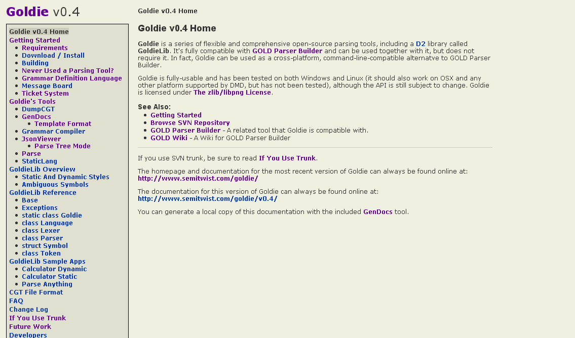
Thanks all for the comments! I've made a few more tweaks, put up two sample
pages, and would like to get some opinions on if this now looks "good" or
"acceptable" or "bad" (and maybe improvement suggestions for any "bad"
votes):

http://www.semitwist.com/goldie0.4docBeta2/index.html
http://www.semitwist.com/goldie0.4docBeta2/SampleApps/ParseAnything/index.html

(Most of the links are broken ATM, I know. And FWIW, "beige" is what I was
trying to go for with the background.)

FWIW, the old v0.3 documentation is here:

http://www.semitwist.com/goldiedocs/current/Docs/

I want to at least make sure that the 0.4 docs are an improvement on that.