On 02/22/2011 03:22 AM, Nick Sabalausky wrote:
"Nick Sabalausky"<a@a.a>  wrote in message
news:ijpvpl$2l8u$1...@digitalmars.com...
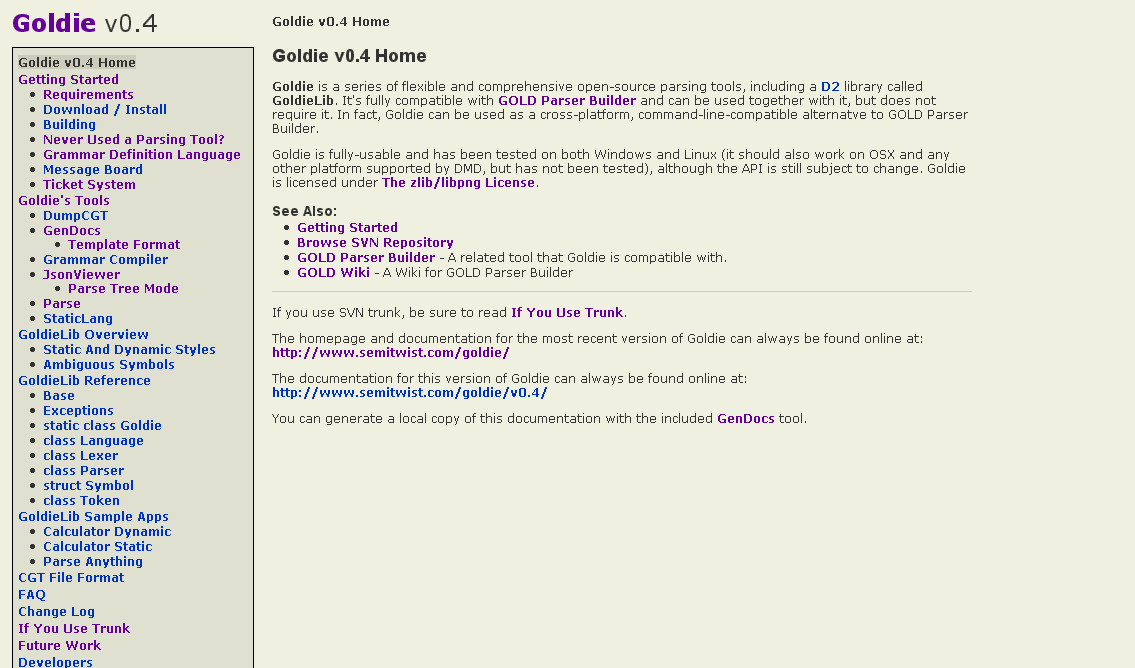
I've been updating the docs for my Goldie project in preparation of a new
release, and figured the they looked a bit...sterile, so I've tweaked the
CSS a bit. And, well, I think I've stumbled upon a heisencolor...(or a
heisenhue, rather)
Without reading any replies or "cheating" by inspecting the pixels in a
paint program, take a look at this screenshot:

http://www.semitwist.com/download/goldie0.4docBeta.png

...and reply with what color you think the background looks like (the main
background, not the
sidebar). And whether or not you like it would be helpful, too, of course.
And, strange as this may sound, reply again if you end up changing your
mind on what color it looks like.
Thanks all for the comments! I've made a few more tweaks, put up two sample
pages, and would like to get some opinions on if this now looks "good" or
"acceptable" or "bad" (and maybe improvement suggestions for any "bad"
votes):

http://www.semitwist.com/goldie0.4docBeta2/index.html
http://www.semitwist.com/goldie0.4docBeta2/SampleApps/ParseAnything/index.html

(Most of the links are broken ATM, I know. And FWIW, "beige" is what I was
trying to go for with the background.)

FWIW, the old v0.3 documentation is here:

http://www.semitwist.com/goldiedocs/current/Docs/

I want to at least make sure that the 0.4 docs are an improvement on that.
[Nick: I think you'd rather provide a valid email and ask people to reply off
list. Would be much nicer, I guess. You can write it down like "nick <at> site
<dot> org" to avoid spam bots.]
I think the intention is good, IIUC, but the choice of colors is not.
There are rules and tricks to choose and "marry" colors but it's a big &
difficult domain in any case (it's about impossible if you use a color chooser
based on HSV instead of HSL, for some reasons.) And there are indeed questions
of taste.
Just as an example:
* main background color less sad (hue=44): #FCE6A9 (or even more rose, hue=33:
#FCD7A9)
* darken it (L component) for side bar color: #E0CD96
* intensify it (S component) for frame bg color: #FFE28F
The contrasts are rather slight, close to minimal; do your own trials.
You can also play with main foreground color, giving it the same hue (instead
of absolute black): eg #383019. I like to also use a color that constrasts with
the hue used everywhere else, for instance for titles and/or frame borders: eg
#1F3832.
Denis

PS: example using such color choosing principles: http://spir.wikidot.com/
--
_________________
vita es estrany
spir.wikidot.com