On 02/27/2011 09:21 AM, Nick Sabalausky wrote:
"spir"<denis.s...@gmail.com>  wrote in message
news:mailman.1875.1298389603.4748.digitalmar...@puremagic.com...
On 02/22/2011 03:22 AM, Nick Sabalausky wrote:
"Nick Sabalausky"<a@a.a>   wrote in message
news:ijpvpl$2l8u$1...@digitalmars.com...
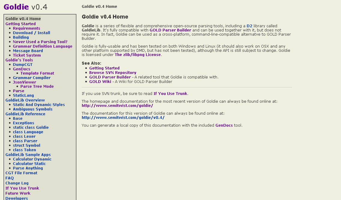
I've been updating the docs for my Goldie project in preparation of a
new
release, and figured the they looked a bit...sterile, so I've tweaked
the
CSS a bit. And, well, I think I've stumbled upon a heisencolor...(or a
heisenhue, rather)
Without reading any replies or "cheating" by inspecting the pixels in a
paint program, take a look at this screenshot:

http://www.semitwist.com/download/goldie0.4docBeta.png

...and reply with what color you think the background looks like (the
main
background, not the
sidebar). And whether or not you like it would be helpful, too, of
course.
And, strange as this may sound, reply again if you end up changing your
mind on what color it looks like.
Thanks all for the comments! I've made a few more tweaks, put up two
sample
pages, and would like to get some opinions on if this now looks "good" or
"acceptable" or "bad" (and maybe improvement suggestions for any "bad"
votes):

http://www.semitwist.com/goldie0.4docBeta2/index.html
http://www.semitwist.com/goldie0.4docBeta2/SampleApps/ParseAnything/index.html

(Most of the links are broken ATM, I know. And FWIW, "beige" is what I
was
trying to go for with the background.)

FWIW, the old v0.3 documentation is here:

http://www.semitwist.com/goldiedocs/current/Docs/

I want to at least make sure that the 0.4 docs are an improvement on
that.
[Nick: I think you'd rather provide a valid email and ask people to reply
off list. Would be much nicer, I guess. You can write it down like "nick
<at>  site<dot>  org" to avoid spam bots.]

I think the intention is good, IIUC, but the choice of colors is not.
There are rules and tricks to choose and "marry" colors but it's a big&
difficult domain in any case (it's about impossible if you use a color
chooser based on HSV instead of HSL, for some reasons.) And there are
indeed questions of taste.

Just as an example:
* main background color less sad (hue=44): #FCE6A9 (or even more rose,
hue=33: #FCD7A9)
* darken it (L component) for side bar color: #E0CD96
* intensify it (S component) for frame bg color: #FFE28F
The contrasts are rather slight, close to minimal; do your own trials.
You can also play with main foreground color, giving it the same hue
(instead of absolute black): eg #383019. I like to also use a color that
constrasts with the hue used everywhere else, for instance for titles
and/or frame borders: eg #1F3832.

Denis

PS: example using such color choosing principles: http://spir.wikidot.com/
Thanks a lot for all the advice :)

I've tried your suggestions and I think it does look much nicer:

http://www.semitwist.com/goldie0.4docBeta3/index.html
http://www.semitwist.com/goldie0.4docBeta3/SampleApps/ParseAnything/index.html

I might try playing around with the link foreground colors later if I get a
chance.

I think one of the things that kept thwarting my attempts is the
relativistic nature of color perception. For instance, when I first tried
your color suggestions ("Beta3" above), it looked very, very orange to me.
But then I switched back to my "Beta2" and that suddenly looked downright
green. Then I looked at your site, which seems fairly rosy, and then back to
"Beta3" which now looks perfect even though it's the exact same color that
seemed very orange after looking at "Beta2" first. That effect makes
adjusting colors seem annoyingly non-deterministic.

Funny thing is, some of those principles you mentioned are things I've been
aware of (like different hues of black), but without enough artistic
experience, I'll be dammed if I seem to be able to remember to actually
*use* half those techniques ;)

I'm realizing now that tweaking based on RGB certainly seems to be a bad
idea unless you really know what you're doing. HSL is definitely much more
natural to deal with, and tends to fit the problem domain better, even
though being a long-time low-level coder has managed to train me to
automatically think "RGB" whenever I think "color". You do seem to be right
about HSV being a pain compared to HSL: I'd been using GIMP's color chooser
which is HSV, and the V is a pain when you want to adjust the brightness of
a light color without messing with the saturation, too. I don't suppose you
know offhand of a good free HSL color chooser on Windows?
No, sorry (I have left windows for a long time).
You are right about HSV. The point is its V component only covers half range of
'lightness'. Precicely, it covers from black to the maximal 'natural' lightness
of the corresponding 'pure' color of the same hue.
It may be better when you're dealing with material (substractive) colors,
meaning paints. For instance to print it out on paper. Then, the max V
component gives the pure color you get out of the paint tube. Maybe it's the
reason why older image manipulation software started using HSV; then, the error
propagated into newer software (just like in programming languages ;-). But
it's easy to get it with HSL as well: just set L to 50%; so, the advantage of
HSV with material colors is not that big, I guess.
But the drawbacks of HSV are painful: since L only covers half of the lightness
range, then the rest must be covered somewhere (to get the whole color space):
namely, it is taken by the S component. This means that S, which should
intuitively allow setting the saturation (I call that "vividness"), in fact
also takes a part of lightness: when you move the S cursor, you change both
saturation & lightness! Thus, both S and V are messed up. Worse even, I think
(not sure) that V is messed up only on its higher part of its range (since for
the lower part ligntness is set separately by V). I have never managed to get
an accurate mental model of HSV: what is 'S' in HSV? (answers off list welcome
;-) While the mental model of HSL is obvious, trivial (for me at least).
To sum up: use HSL.
With HSL component scales, it's easier (not easy) to compose nice looking color
palettes; especially ones that do not look like a messy (or random)
/juxtaposition/ of colors: mainly play with S and/or L.
As a side-note, /all/ default syntax-highlighting style sheets I have ever seen
are horrible from this point of view ;-) (I use much less colors, and some
distinctions are marked via S or L only.)
Denis
--
_________________
vita es estrany
spir.wikidot.com