Hi All,

My first goal in this post was mainly
to get some tricks to get the old font
back by myself... perharps it's not the
time, but i won't give up ;)
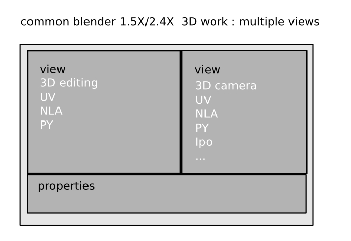
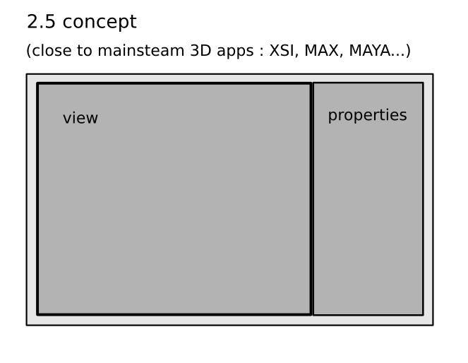
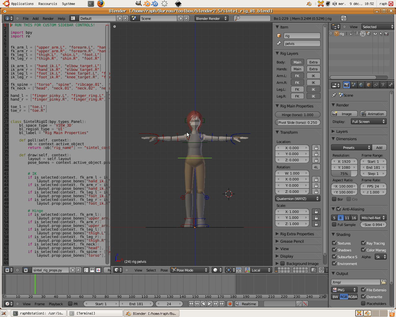
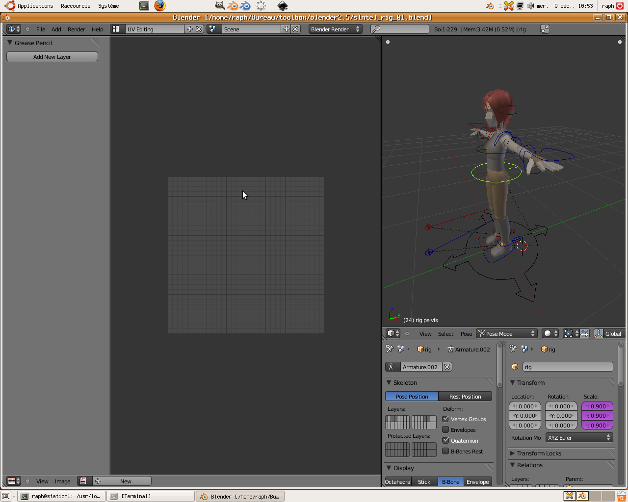
Talking about the new UI layout is probably
to late, but the problem is for me more
deeper than placing buttons or pannels.

Currently, the UI state is floating between
two (incompatibles) concepts :

-The original 1.5 blender came with a very
inovative an elegant kind of layout, that alowed us
to display in the same time 2 differents
data views (3D+UV e.g.) and a complete, compact
-hozitontal- area for props and tools.
http://dwarf.free.fr/blender2.5/ui_issues/2.4concept.jpg

That was very productive, but hard to expand/maintain

-The new UI concept comes with an other approach:
1 big view + 1 or more vertical bars for tools and
props, like this:
http://dwarf.free.fr/blender2.5/ui_issues/2.5design.jpg

Unfortunately, in most 3D works, you frequently
need to have 2 views (3D + UV...). So, the new concept can lead
to this:
http://dwarf.free.fr/blender2.5/ui_issues/2.5overlap.jpg

Or worst :

here are some more examples. I made screenshots
of UI layouts that comes from a file made by the Durian team
(http://storage.cessen.com/perm_links/2009/durian/sintel_rig_01.blend)

http://dwarf.free.fr/blender2.5/ui_issues/01.png
http://dwarf.free.fr/blender2.5/ui_issues/02.png
http://dwarf.free.fr/blender2.5/ui_issues/03.png
and this one
http://dwarf.free.fr/blender2.5/ui_issues/04.png

i don't know how it is possible to make long and
productive working sessions with such layouts.

The opinion of the Durian tream on this subject
would be great.
_______________________________________________
Bf-committers mailing list
[email protected]
http://lists.blender.org/mailman/listinfo/bf-committers