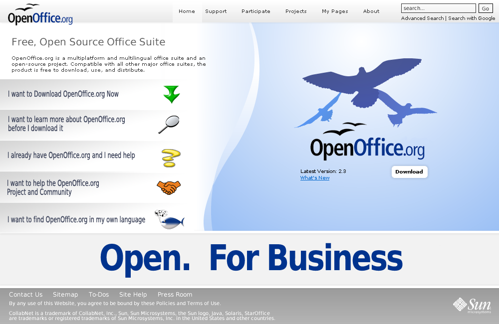
On Tuesday 04 December 2007 16:25:22 William Case wrote:
> On Tue, 2007-12-04 at 15:02 +1300, Graham wrote:
> > On Tuesday 04 December 2007 12:37:37 William Case wrote:
> > > Hi;
> >
> > Hi Bill,
> >
> > > Taking that liberty.
> >
> > No liberty taken, much welcomed in fact.
> >
> > > [snip]
> > >
> > > > >> 4. http://www.apple.com/iwork/
> > > > >
> > > > > Nobody at apple has dialup, that is obvious.
> > > > >
> > > > :)
> > >
> > > I think that the
> > > http://www.molcan.cz/download/ooo3.jpg is still the best so far:
> >
> > There is lots to be said for Filip's design but it would load like a slug
> > on prozac on dialup just like the i-works one.  I don't know what it's
> > like in the rest o f the world, but in Australia, dialup connection
> > accounts for about 40% of all connections, in NZ it's over 50% and both
> > countries are first world.  Where does that leave the rest
> >
> > Graphics take an age to load. So on that measure it is not very good User
> > Experience
>
> Well, I haven't had to use dial-up for years, so I'll take your word for
> it.  I agree, the greatest marketing potential is with people around the
> world who are or are going to be new to computers; that is, the vast
> majority of the world.  Those are the very people who NEED a free office
> suite.
>
> I can't help you figure out how to best create for dial-up, but I do
> have some knowledge about what might work best as far as content is
> concerned.
The best thing for dialup is to do as much as possible in CSS using very small
file size graphics.  Ivan's  variation on Nicks proposal did that the best as
far as I can see.

Most people on Dialup are pretty patient, but when they go to a website that
obviously has made no attempt at considering their needs they leave..
quickly.


> > [....]
>
> I tried to outline some of those principles in the snipped parts:
>
> 1) draw people in with smiling faces or human actions.

What we often call the Comic Book attraction.  I agree.

> 2) divide up the various target audiences.  I have called them;
> Explorers, First Time Downloaders, scratch the term upgraders and call
> the next group Extenders and Extras, Participants and Developers.  Reach
> them all through single home page -- called a 'splash' page elsewhere.

Upgraders are in fact important.  Surveys have been done that show the average
OOo user has downloaded 6 times.  There are however two types, those who are
active within the community and those that only come to upgrade to the latest
version. The former probably have their favourite Mirror bookmarked or like
me like to have the latest Pavel Janik build.  The latter want to be able to
come to the home page and hit  "Download Now!"

We need just to take pause for a moment and remember the specific requirements
that have been asked for.  The primary factor is  "Increase Downloads".

We therefore need to define them according to reason for coming to the OOo
home page.  You basically have three groups that we are interested in at this
point. (I know there are a lot more but to achieve our primary goal they are
of minor relevance to this discussion.  They will be a lot more relevant when
we move to the portal.openoffice.org domain discussion)

Casual arrivals or Foot traffic:  This arrival came here out of mild
curiosity, he clicked a link in a Google ad or a context ad or a Keyword.
There is no intention to download.  His motivation is curiosity  The answer
to his "What Now " question is on the button marked "I want to learn more
about OpenOffice.org"

The second group are the informed arrivals, they know what they're here for
they clicked on a link deliberately to come to OOo.  they could be either
First Timers or Upgraders we mentioned them a couple of paras back.

The third Group are the  Cognoscenti,  They are active community members and
have been to the point where they know their way around.  They don't require
big buttons or graphics just text links that are in familiar places


> 3) Use button links to direct them to their respective sub-home pages.

Agreed.

>
> The main purpose of each page I see as follows:
> 1) Main Home Page - capture peoples interest and attention and make it
> easy for them to choose which area they want to be in.

Yep, agreed

>
> 2) The 'What is OpenOffice' sub-page and links -- marketing for
> Explorers.

That's why.openoffice.org

>
> 3) The 'DOWNLOAD' page -- reassurance and explanation of how to download
> and install successfully-- with a 'DOWNLOAD NOW' button for First Time
> Downloaders.  With perhaps an 'ADVANCED DOWNLOAD' for more experienced
> users who want down load CVS, unstable, older versions, or different
> O/Ss for whatever reason.

Don't overwhelm with information though, that is just another barrier.

>
> 4) The 'GET SUPPORT' page for all users that should be divided into two
> sections; on line support such as forum, irc and mailing list.  And, a
> documentation section.  These two sections can fork from the support
> page.

Again that's already there, support.openoffice.org, just needs a little
tittivating as it's a bit heavy going right now, but I agree simplify it.

>
> 5) The 'PARTICIPATE' sub-home page which includes contributions.  In my
> view, pages 1), 2) & 3) should be graphically related to keep new users
> comfortable about being in the right place.  From 4) onward as the
> subject matter gets more technical the basic lay can vary to suite the
> needs of the subject at hand.  New users would not be surprised by that
> and, in fact, see the changing layout as a visual cue that they are
> getting in too deep for just an Explorer.

contributing.openoffice.org is already there, However it's low priority on the
Home Page beyond a text link.  We give our new users as few possibilities as
is feasible

>
> 6) A new suggestion.  Call the next button and home page 'EXTENSIONS &
> EXTRAS'.  That is clear.  People would expect to find extensions,
> plug-ins, templates, clip art and the like presented here and would not
> be surprised if the layout was straight forward and simple involving
> lots of text descriptions.

Link to extensions does not need to be prominent

>
> 7) The 'FOR DEVELOPERS' button and page should be what it says it is --
> a site (page) that developers want to go to and which new users don't.
> This page and its links is all business; all meat and potatoes as it
> were.

As above, this will go eventually to portal.ooo
>
>
> [snip]
>
> > > Maybe 'EXTENSIONS ETC.' on the home page then a choice and a toolbar in
> > > the 'EXTENSIONS' sub-home page.
> >
> > Fair enough, however the experienced ones would most likely go straight
> > to their favourite project.  Remember we have to deal with the lowest
> > common denominator in terms of internet sophistication
>
> Precisely.  We want and expect experienced users to go directly to their
> favourite project.  In fact we should ease them on their way by making
> sure that the appropriate URLs are easy to use, remember and store.
>
> But you also have to remember, that every experienced user has to come
> to OOo the first time.  They maybe programmers etc. but the first time
> they come to OOo's site they need directions to the 'FOR DEVELOPERS'
> page at least once.

Then have the New user buttons centre stage and the Dev buttons off screen.

Remember our priority is downloads

>
> > > > >> - do you think it is still appropriate to include some lines
> > > > >> explaining in very global terms, e.g. "OpenOffice.org is a
> > > > >> multiplatform and multilingual office suite and an open-source
> > > > >> project. Compatible with all other major office suites, the
> > > > >> product is free to download, use, and distribute. "
> > > > >
> > > > > Yes and No.  It's about prominence on launch and so long as it is
> > > > > readable but not the most prominent thing when the page launches.
> > > > > However the above statement is clear and concise and relevant and
> > > > > gives our casual "Foot traffiic" client one more nudge to hit the
> > > > > "I want to learn more...." button / icon / link.  I'm more in
> > > > > favour than not
> > >
> > > KISS.  Put definitions in sub-domains.  In this case, the 'What is
> > > OpenOffice?' sub-home page.
> >
> > I'm not sure what you mean here. This is not a definition, rather a
> > couple of sentences explaining what people are looking at on this
> > webpage, I'll admit I'm not hugely committed one or another but if I was
> > told to get off the fence I would probably go for leaving it.
>
> Well, for what it is worth, I would hide it. Just use a prominent loud
> 'FREE' on the home page instead.

Actually looking back on the designs I'm beginning to agree with you, But as I
said I'm still not far from the fence.  I'll think a bit more on this.  Not
big on the FREE though, it has been recognised as a barrier to uptake

Most of what you say I have said already, it's just that I'm advocating using
resources that are already in place so that the work should just be a little
fine tuning outside the home page at this stage.  Any major reconstruction of
those pages can then be done later.

Lets not send anyone to the about.openoffice.org page though, that ones just
plain scary!  ;)

My favourite at the moment is still

 http://wiki.services.openoffice.org/mwiki/images/5/52/Siteconcept2.png

But them I'm biased, there's a couple of small images and the rest can be done
with CSS

and this one a close second

http://www.patentpending.co.nz/images/openoffice/splashpage.png


Cheers
GL


--
Graham Lauder,

INGOTs Assessor Trainer
Moderator New Zealand
(International Grades in Office Technologies)
www.theingots.org
Phone DDI +64 7 886 8171
Mobile +64 27 494 4315

OpenOffice.org MarCon (Marketing Contact) NZ
http://marketing.openoffice.org/contacts.html

---------------------------------------------------------------------
To unsubscribe, e-mail: [EMAIL PROTECTED]
For additional commands, e-mail: [EMAIL PROTECTED]